How to Get Viewport Width in JavaScript
When designing responsive websites, understanding the size of your user’s viewport can be a game-changer. It’s the key to creating a seamless and interactive user experience across different devices. Knowing how to determine the viewport width in JavaScript can equip you with the ability to fine-tune your website’s layout dynamically.
Don’t worry if you’re not familiar with how to get this done. I’ll guide you through the process in a manner that’s straightforward and easy to comprehend. By the end of our journey, you’ll be able to confidently manipulate your designs based on the viewport width.
In this post, we will be looking at the following 3 ways to get viewport width in JavaScript:
- By using window.innerWidth property
- By using document.documentElement.clientWidth
- By using document.body.clientWidth
Let’s explore each…
#1 – By using window.innerWidth property
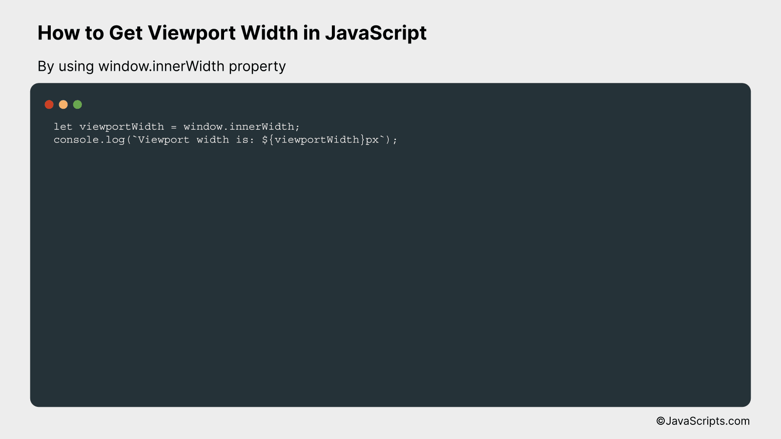
The window.innerWidth property in JavaScript provides the width of the viewport in pixels. It allows us to determine the current viewing area available in a web browser, excluding toolbars and scrollbars. Let’s take a look at an example for better understanding.
let viewportWidth = window.innerWidth;
console.log(Viewport width is: ${viewportWidth}px);
How it works
The window.innerWidth property returns the width of the viewport in pixels, including the scrollbar if it’s visible.
Here’s how this works:
- The JavaScript window object represents a browser window or tab. All global JavaScript objects, functions, and variables automatically become members of the window object.
- The innerWidth property is part of the window object and returns the interior width of the window in pixels. This interior width includes the width of the vertical scrollbar if one is present.
- In our code, window.innerWidth retrieves the current width of the viewport and stores it in the viewportWidth variable.
- Finally, console.log() is used to print the viewport width to the console. The message is a string created using template literals, which allow us to include JavaScript expressions inside the ${} syntax.
#2 – By using document.documentElement.clientWidth
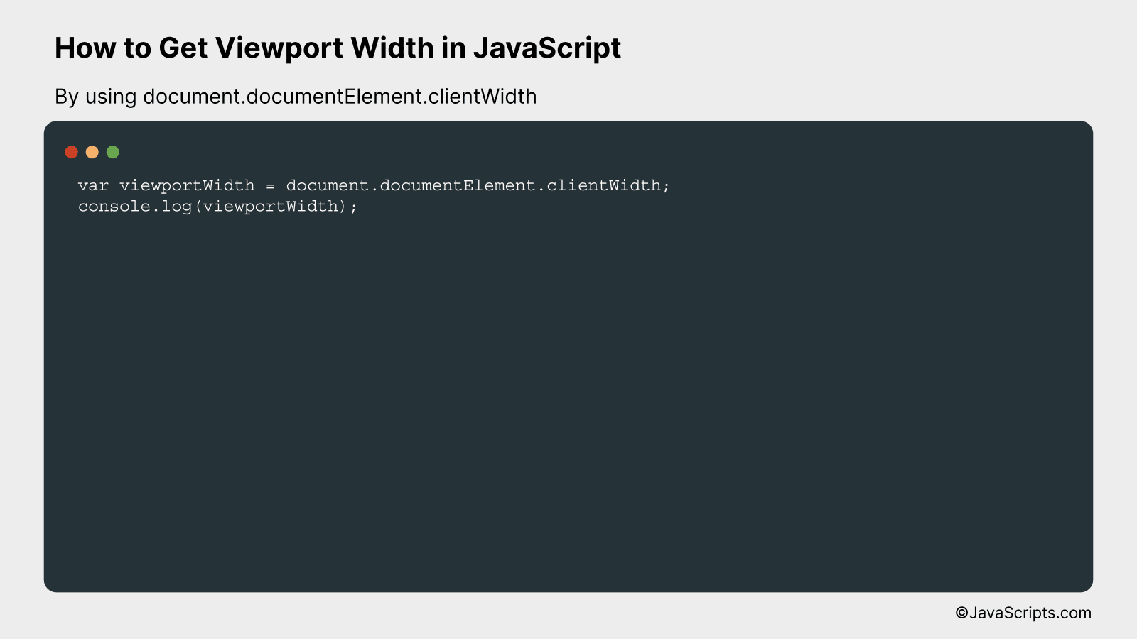
This JavaScript line of code will return the width, in pixels, of the viewport (the visible portion of the document’s content area) by accessing the clientWidth property of the document’s root element.
var viewportWidth = document.documentElement.clientWidth;
console.log(viewportWidth);
How it works
document.documentElement.clientWidth is a JavaScript property that returns the viewable width of a document in pixels, excluding the vertical scrollbar (if any), border, and the margin/padding.
- document: This is a built-in object that represents your webpage. You can access elements on your website and manipulate them using the document object.
- documentElement: This property returns the Element that is the root element of the document (for example, the element for HTML documents).
- clientWidth: This is a read-only property that returns the inner width (in pixels) of an element. It includes padding but excludes borders, margins, and vertical scrollbars (if present).
- viewportWidth: We’re storing the width of the viewport in this variable to use it later as needed.
- console.log(viewportWidth): This line of code will print the viewport width to the console. This will allow you to check the width of the viewport.
#3 – By using document.body.clientWidth
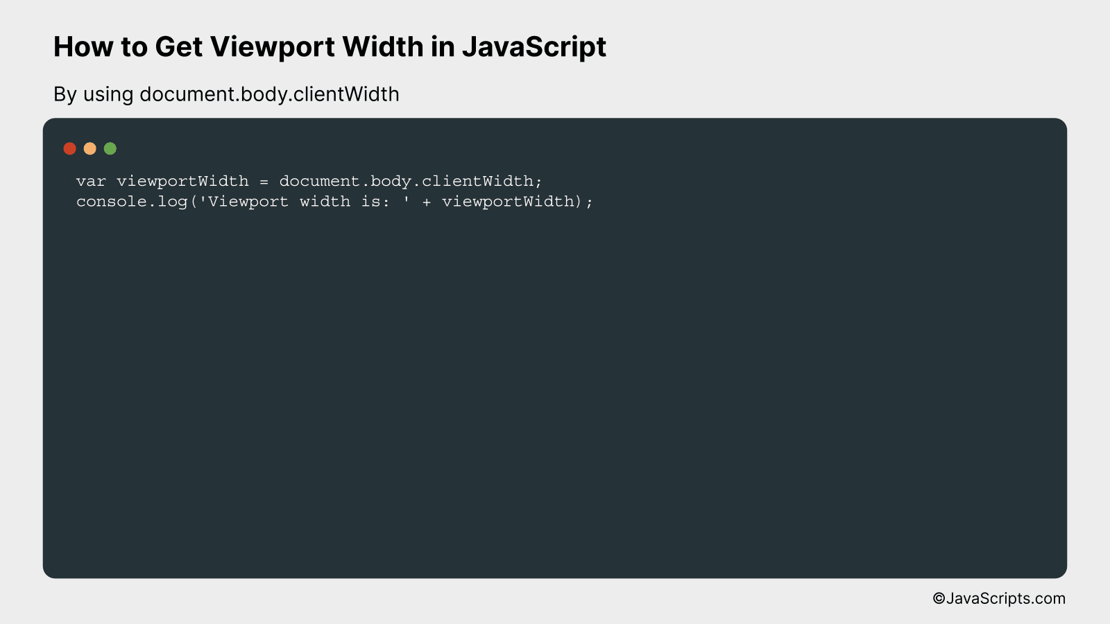
This method retrieves the viewport width by using JavaScript’s document.body.clientWidth property, which returns the inner width (in pixels) of the body of the HTML document, excluding scrollbars if they’re visible.
var viewportWidth = document.body.clientWidth;
console.log('Viewport width is: ' + viewportWidth);
How it works
The document.body.clientWidth property returns the viewport width (in pixels) of the body of the HTML document. It subtracts the width of the scrollbar if one is present. This can be useful for responsive design manipulations, animations, or general layout adjustments based on the viewport size.
- The document object is the root node of the HTML document.
- The body property of the document object gets the element.
- The clientWidth property is a read-only property of the Element interface in the Web API. It represents the inner width of an element in pixels, including padding but excluding the scrollbar (if it’s visible) and border.
- We store this value in the variable viewportWidth.
- Finally, we log this value to the console to confirm the obtained width.
Related:
- How to Get the Domain from a URL in JavaScript
- How to Generate Random Numbers Between Two Numbers in JavaScript
- How to Find All Occurrences with JavaScript
In conclusion, understanding and utilizing the viewport width in JavaScript can significantly improve your web development skills. It allows you to create responsive designs and enhance user experience on different devices.
Always remember, the ‘window.innerWidth’ property and ‘document.documentElement.clientWidth’ method are the most reliable ways to get viewport width. Happy coding, and keep exploring new JavaScript techniques!